April, 2019
I love paying for parking with my phone, but Minneapolis’s parking vendor ParkMobile’s app leaves a lot to be desired. Let’s take a look at the most common flow that I use—plugging a parking meter via the app.
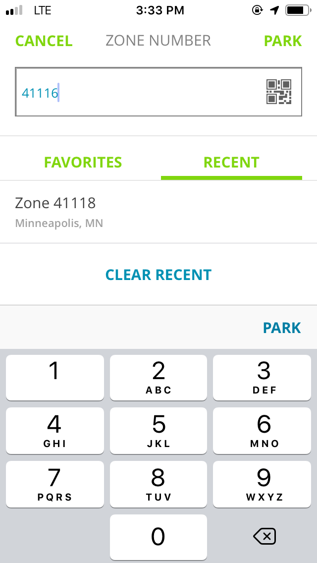
So far, it’s pretty straightforward. Let’s use the keypad to type in the number assigned to the space I’m parked in.
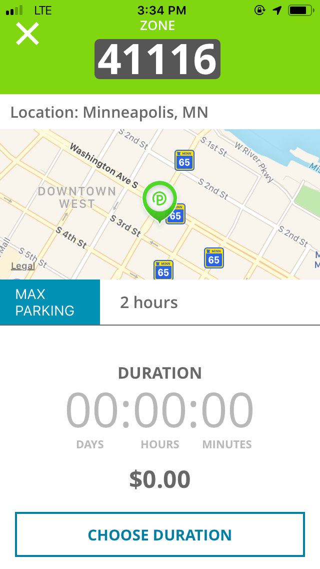
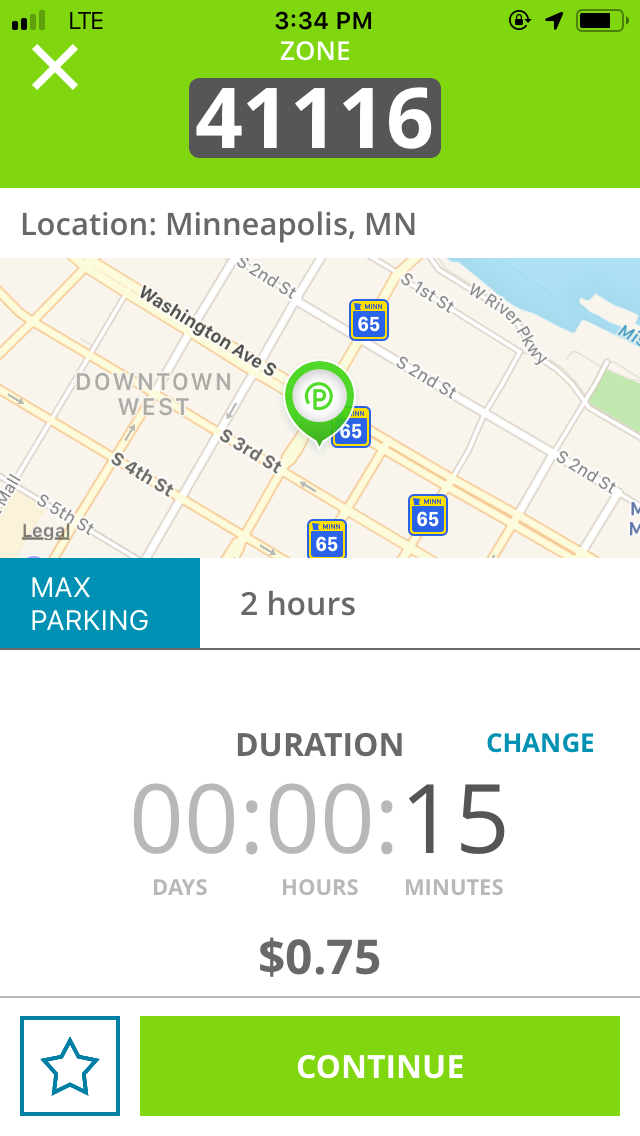
This screen is where things start to go south. Firstly, that map is never accurate. Not sure this map is necessary at all. I bet you could kill it, since I’m likely to be standing next to the car. Secondly, there is no information about the rate at the space. How much does it cost per hour?
Let’s choose a duration. Of course I want to choose a duration.
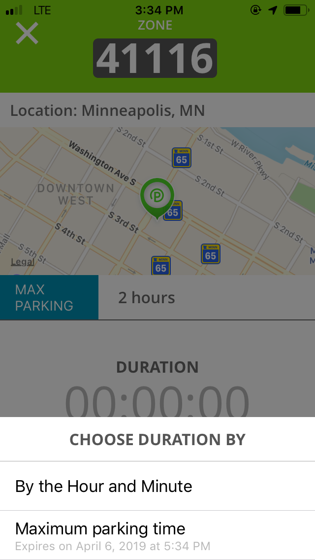
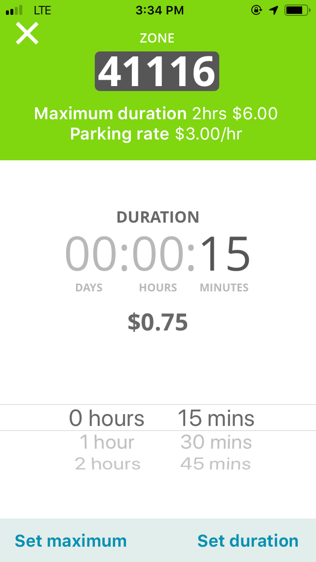
Why block my workflow and ask if I want to choose duration by the hour and minute or by the maximum parking time? Just let me choose the duration straight away. How much is the maximum parking time?
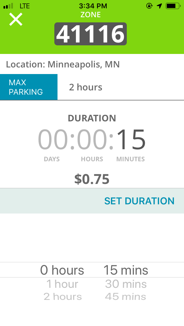
Alright, after 3 screens, I can select how long I’d like to park.
My 15 minutes of parking is ready to go. I’ll press the continue button.
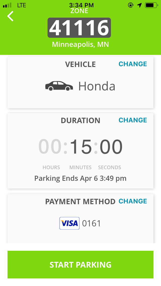
I can confirm the duration and the vehicle I’d like to park. Additionally, I can change my preferred payment method.
This simple kiosk of an app takes 5 taps and way too many decisions to pay for parking. At this point, it’s often faster to just toss some quarters into the meter. This app should be convenient. We can do better.
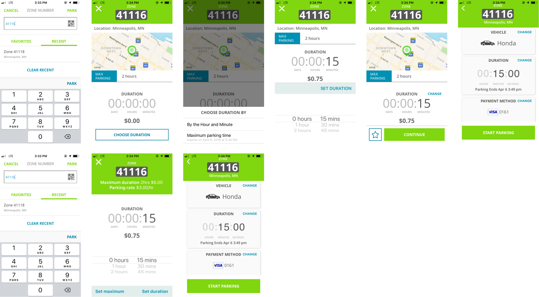
Space number entry
Nothing wrong with this screen, really. We could consider cleaning up some of the visuals, but fundamentally this is good. Moving on.
The original flow has so many taps, each representing a decision. Let’s get right to it in this second screen. We have our space number, so let’s show the maximum duration and the hourly parking rate.
Let’s skip all the questions and just open the task to set the parking duration. I can change the duration by interacting with the sliders, or I can tap “Set maximum” to choose the max duration without asking each user to think about how long they want to park upfront. Pressing either “Set maximum” or “Set duration” will advance the user to the confirmation screen. No need for another interstitial.
We can drop users directly into the final confirmation screen. From here, they can go back and edit any of the values they need, or change their vehicle.


With some tiny changes to the user experience of ParkMobile, we’re able to cut the initial cognitive load while reducing the number of steps from 6 to 3. For an app that drivers may interact with multiple times a day, these interactions add up.
To the folks at ParkMobile, feel free to implement these ideas—or email me and tell me why they’ll never work. As a designer and iOS engineer, I’d happily help implement them. ✌️