2011–2015
At Adobe, I designed a responsive canvas for web design that I had been dreaming of, and brought together a team to build it. This is the story of Reflow.
Reflow is was a design tool for the web. It
offered traditional, visual tools for laying things out on a
fluid canvas. Its canvas just happened to be a browser.
Reflow, like most apps, started as a sketch. It started as a nights and weekends project between myself and a few fellow designerds.
“How, in Adobe’s whole suite of tools, is there no notion of a fluid canvas — one that could adapt to different devices and screen sizes?”
I asked this question often in my first few months at Adobe. What ultimately inspired me to work for Adobe was the opportunity to build tools that didn’t exist yet. During this same time, responsive design had just been coined by Ethan Marcotte. Soon after, I’d converted my portfolio to be a simple responsive, fluid layout. It was painful. I couldn’t imagine having to do this while managing the overhead of working at a magazine publisher, or having to do this for websites in an agency setting. I felt the pain of having to mock up all the layout variations with InDesign or Photoshop, having to build something in HTML and CSS just to be able to mock it up. These problems became an itch I needed to scratch—an itch shared by like-minded creatives.
Within the corporate world, I was very green. I’d just come from being the senior designer at a 6 person shop. If I wanted to share an idea, I’d simply walk over to them or perhaps shoot them with a nerf gun. Inside a company of 11,000, I had no way of facilitating the creation of something like this. I didn’t even know who I’d talk to. I’d sent out a calendar invite to the few people that I’d met in Adobe’s experience design group, asking if anyone was interested in brainstorming and hacking on a prototype with me. Responding to my emails, Bradee Evans, a manager within the group, put me in touch with engineers Kristofer Joseph and Tara Feener.
During these first meetings I shared my idea for a responsive ruler. We whiteboarded the ability to drag and drop arbitrary breakpoints. It spawned a conversation defining the need for a tool whose canvas is the web, with all its peculiarities. We wanted to build a design tool that didn’t coddle ex-print designers. We weren’t building the next Dreamweaver or a product like Muse. This was a design surface true to its medium. CSS selectors would replace layer styles. Web-based font services would replace unruly lists of local typefaces. We set off to build a prototype while I explored what this product might actually look like.
We’d build the prototype in HTML and Javascript. I would spend time designing and coding the front-end in HTML & CSS while Tara and Kristofer would build everything else in JS and Backbone. It was the fastest way we could share our vision for what ultimately became Reflow. It was also the most disciplined way we could ensure the canvas itself was true to the web. Along the way Bob Walton joined in on the prototype hacking. Bradee kept our efforts on schedule. Tara, Bob, and Kristofer kept it working. I helped to keep it usable, pretty, and most importantly, focused.
Within a few short weeks we had a proof of concept. It made its rounds at Adobe and eventually received a green light. The five of us were now able to work full time on Reflow. Soon, more engineers joined in building out my vision—A tool whose design surface was true to the web. Warts and all.
While building Reflow’s prototype, others at Adobe were building Brackets, an open source code editor. It was in a similar space as Reflow, conceptually. There was also an app named Shadow that allowed you to test your site on all kinds of devices remotely with a single click. The new suite would be called Edge. It would include Edge Reflow, Edge Code (Brackets), and Edge Inspect (Shadow).
These apps all needed a common design language. We pulled our inspiration from Adobe’s efforts in the Creative Cloud. It’d include middle grays that allowed for focus on the user’s content instead of the application itself.
At the time this was originally written, we were still marching toward version 1.0. We’d published a few public previews, allowing me to share some of the thinking behind its features.
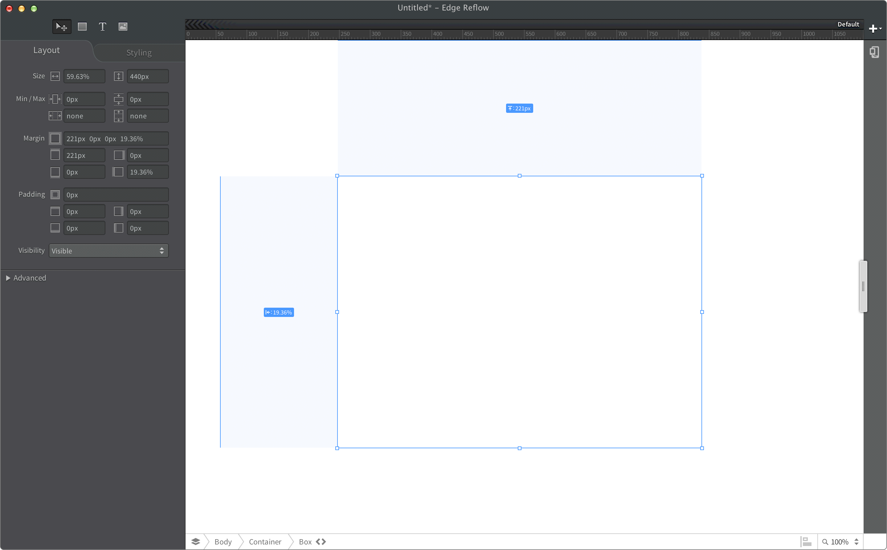
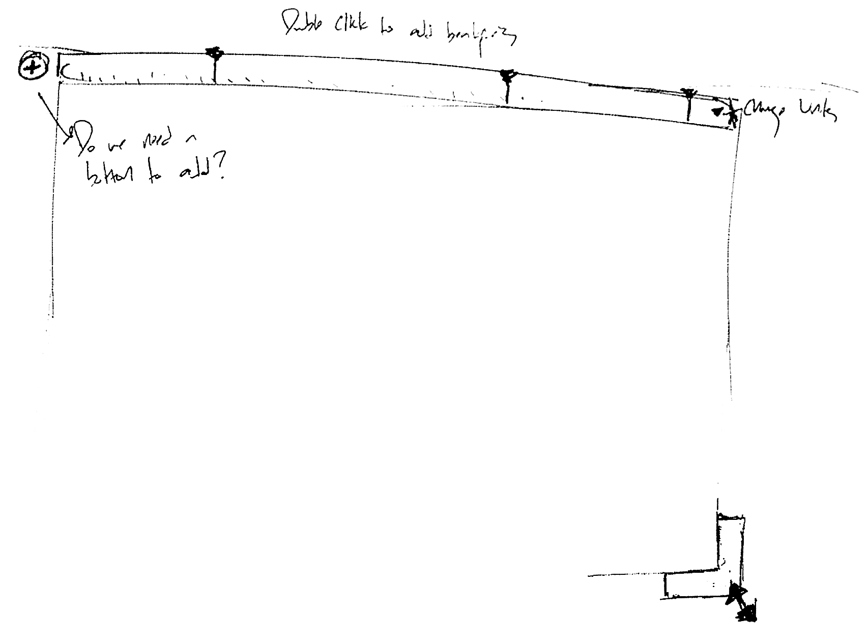
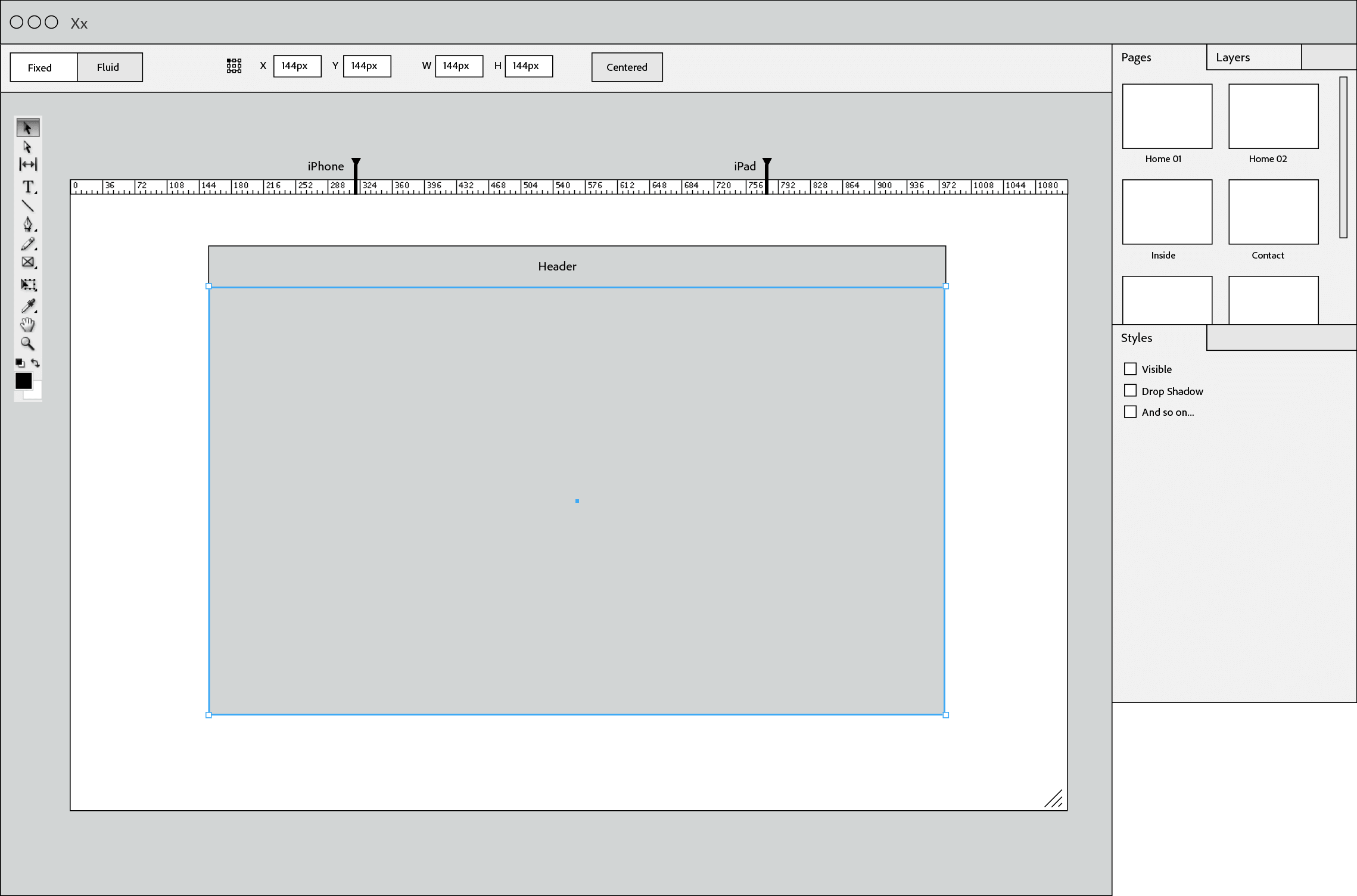
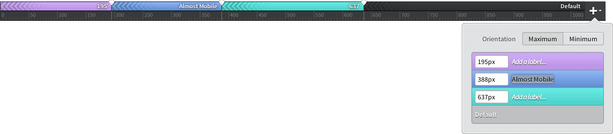
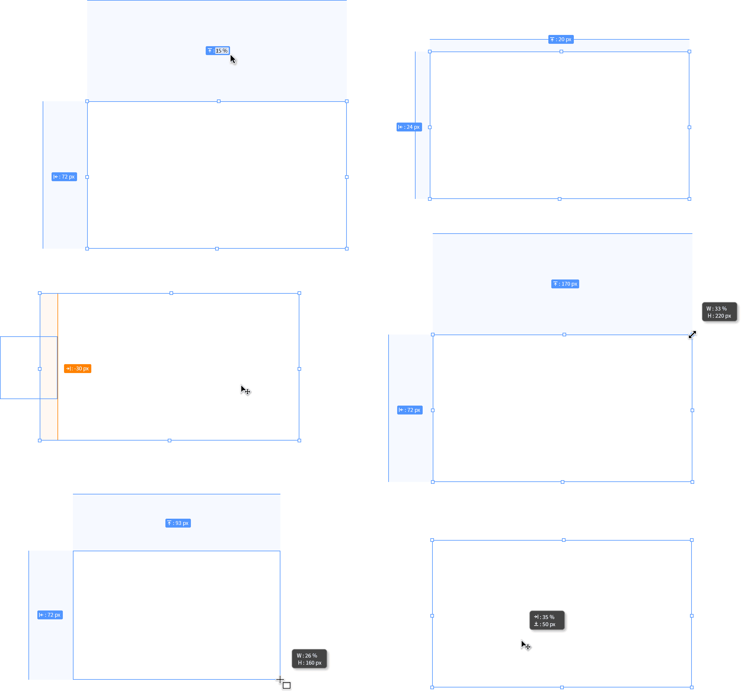
I’m most proud of the central hook of the app, its responsive ruler. The interface would allow you to design a layout, resize the canvas until the layout broke. You’d then add a breakpoint, fix the layout at that size, resize until it breaks, and repeat until all the various sizes were covered. Adding breakpoints was simple. At a glance, you could tell where breakpoints are. They were simple to tweak, add, or remove, all while feeling familiar.
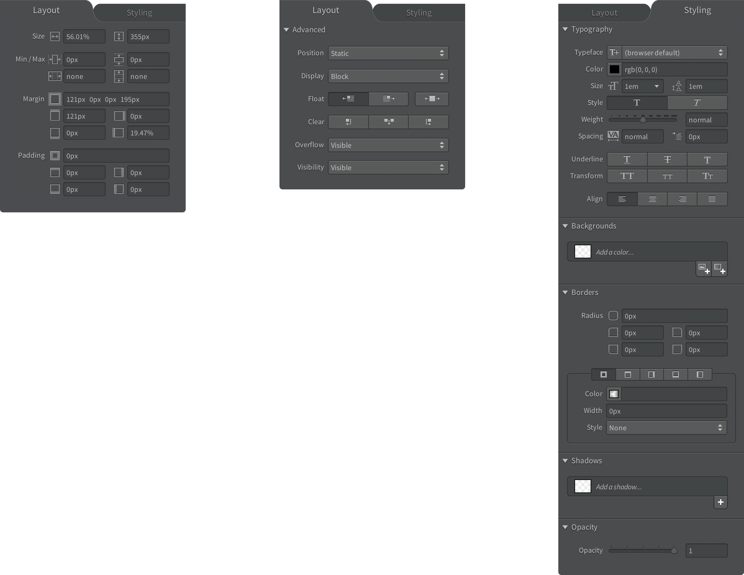
Reflow’s interface bridged the gap between a design tool and coding environment. Normal design inputs were replaced by CSS rules that were prioritized by how often they were used. Width and height, for example, are higher in the hierarchy than margins or padding.
Uncommon declarations were hidden in favor of a sensible defaults.
Fields were laid out in your standard CSS shorthand model of top, right, left, bottom, so users that were accustomed to writing CSS by hand were comfortable with their layout. In fact, if users were comfortable, they could type their values like they would their shorthand.
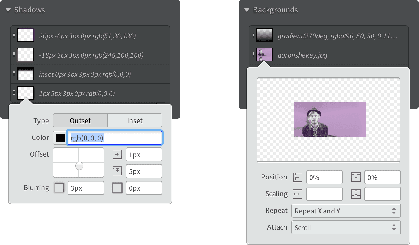
In Reflow, designers weren’t limited to single shadows or backgrounds. Designers could chain effects, building complex shadows. Semi-transparent layers could be rearranged to build composite backgrounds.
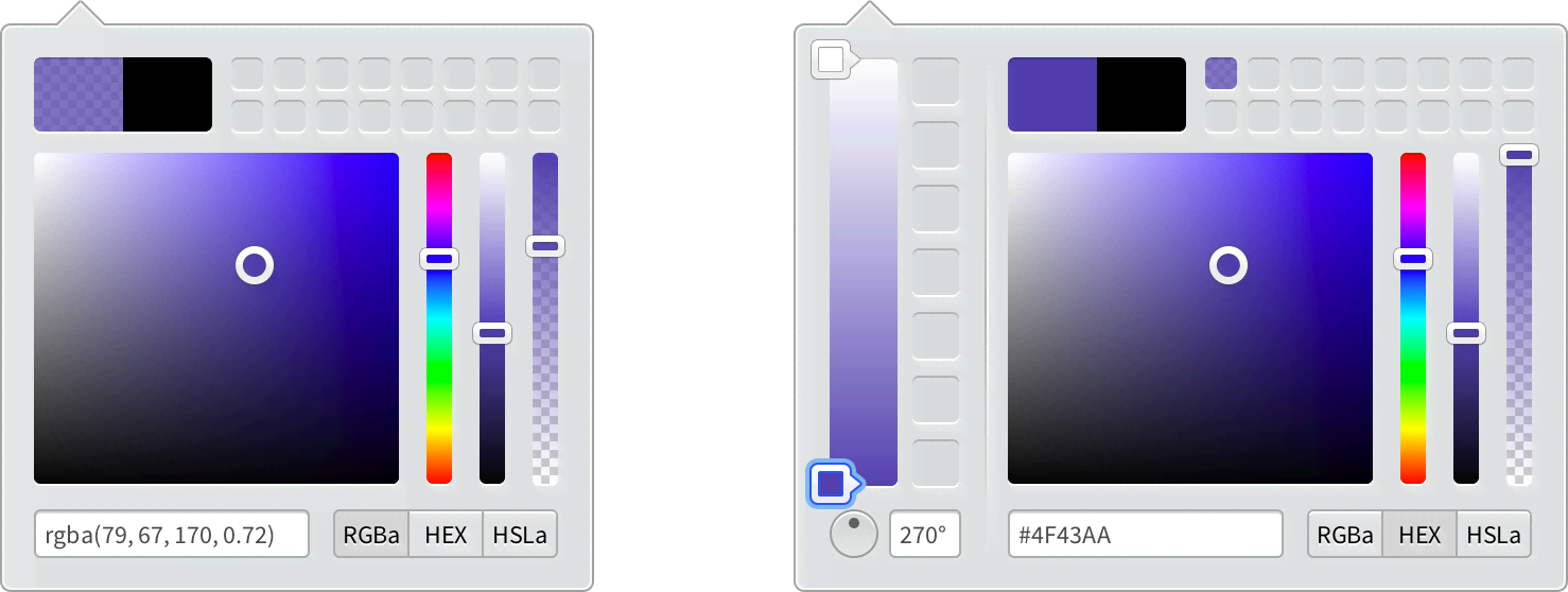
Reflow improved on Adobe’s color picker, a feature that had gone untouched for years. I landed on a solution that improved color selection while maintaining familiarity with current color pickers. It allowed for full control of a single hue from white to black on a single slider.
Adobe’s users have often acquired years of muscle memory when using its creative tools. Many times in testing, users would use keyboard shortcuts that we hadn’t included yet. It was obvious that if this product said Adobe on it, users would be expecting things, for better or worse — Selection models, keyboard shortcuts, and similar tooling.
Reflow removed custom cursors found in other Creative Suite products. Wherever possible, I wanted Reflow to be a good OS citizen. Photoshop is made to look like a native app, but often times it’s anything but.
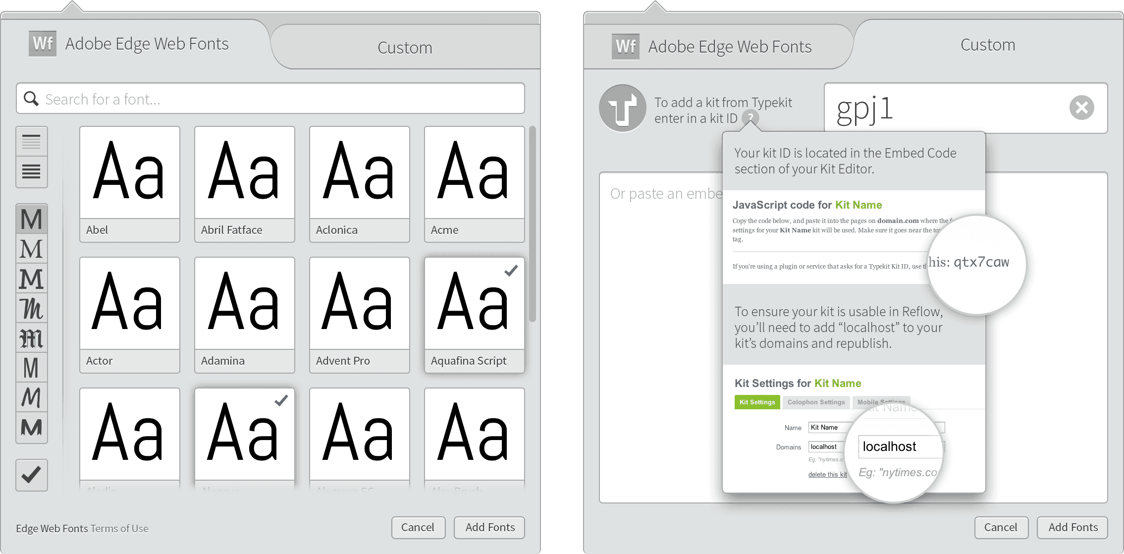
After Adobe’s acquisition of Typekit, we now had the ability to include webfonts natively in Reflow. Instead of unruly lists of local fonts that may or may not work on the web, our font browser would be populated by the newly created Edge Web Fonts. Without visiting the website, users could view and try hosted fonts directly in their designs.
Most of Reflow’s features were displayed in popovers. It allowed users to get in and out of their task without taking them too far from their design.
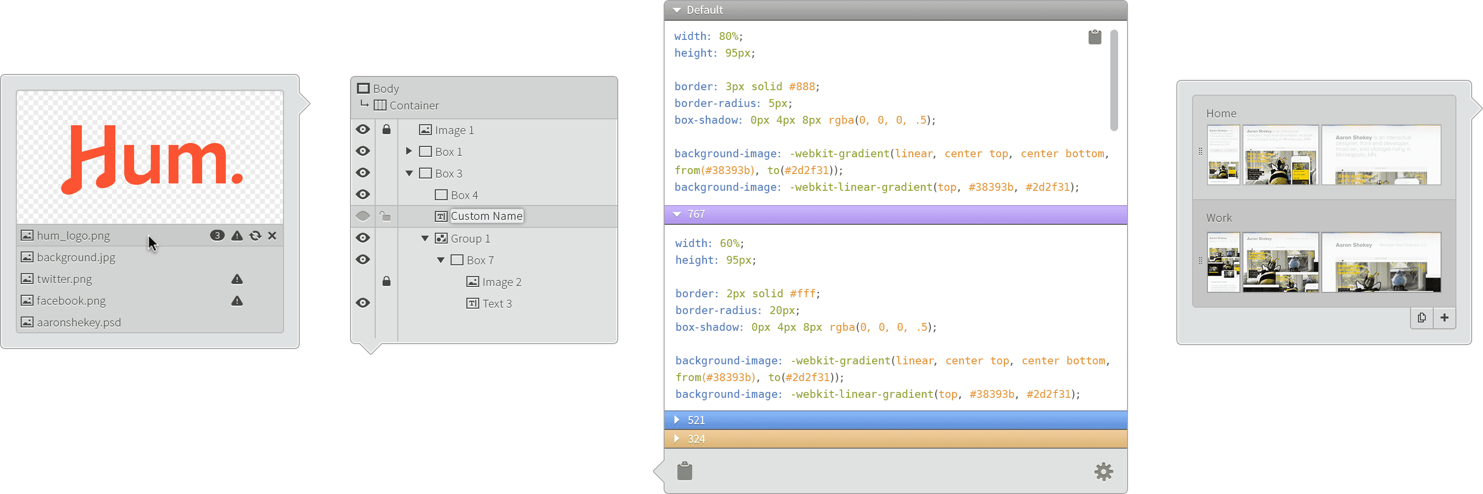
Though I was the sole designer on Reflow, I still occasionally needed to share my work. Regardless of any disparate comps that may have floated around on wikis and elsewhere, a single document needed to collect every asset within Reflow. In a single action one could re-skin the entirety of the app using these slices and modifying CSS.
Reflow took 18 months to get to a usable point with a public preview. It was available for free with a Creative Cloud membership.