2022–2023
In 2022, I joined Boox, a sustainability startup with the mission of eliminating single-use packaging. I was their director of user experience.
Boox’s first product is a reusable shipping box that, unlike cardboard, can be reused around 12 times. Besides reusability, Booxes are stronger, don’t require tape to assemble, fold flat, and can be created in a far wider selection of colors with far more flexible branding.
When tasked with redesigning Boox’s website, we wanted the site to do a few things:
Our pitch was simple, allow for millions of sustainable shipments with zero waste. We chose to highlight 5 verticals in the hero section using 3D animation. We’d show generalized categories—apparel, beauty, grocery, footwear, and beverages. With each vertical, we’d show a different box size with unique branding to show flexibility. To make things a bit more abstract, we candy coated each of the various items inside and outside the box.
With my rough art direction, we hired Jack Harvatt from harvatt.house to create the animation. We couldn’t be more pleased with the result. Once we had our hero asset, we exported a single asset that’d work throughout all the various responsive device sizes. This way, we could do all the necessary cropping within the browser.
It was important to our founders that when a representative from a company visits this site, they’d understand that Boox was ready to scale to their business. We wanted the site to have a single, ever-present call to action button that says “Switch to Boox”. We included our most visible current clients in as many verticals as we could. We included as many real-world examples of our current clientele, and teased launches in countries other than the United States, and outside North America.
Boox has been incredibly fortunate to have a huge wealth of user-generated content to feature on our site. We featured a couple organic unboxing videos from Instagram and animated a real collection of comments below one of the more engaging clips.
Beyond user generated content, Boox has collected a few great bits of traditional online and print media. Of course we included the obligatory “As seen in…” section. When building a brand website in 2023, it’s illegal not to.
This was my first foray into building a Shopify theme to host this largely static website. We wanted to keep our infrastructure on Shopify since we've got a few SKUs on the backend for “purchasing” samples. At the smaller end of our market, we also have self-service purchasing for limited quantaties of Booxes.
With this revamp, we now had a site that satisfied our stakeholders and properly explained the entire endeavor. It also generates leads for our sales folks and legitimizes our brand.
When a product is delivered in a Boox, there is a graphic on the inside of the box that says “don’t throw me away, scan me instead!”. In that moment, a user scans the QR code and is taken to our “scan experience.” This scan experience needs to do a few things:
Look, we really want this box back, ok? So much so that in in its original iteration, we included prepaid shipping labels in our boxes. You’d flatten the box, apply the sticker, and drop it off.
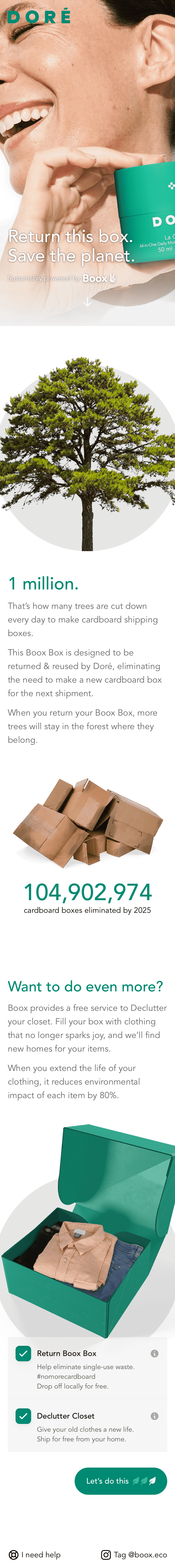
Eventually, we realized our Booxes were an opportunity for more than simple return. We could introduce a concept we call re-commerce with our boxes, allowing users to declutter their home of gently-used clothing and other household items. Brands could offer their customers recycling of their own brand’s packaging—think pump bottles, lipstick tubes.
Our scan experience would need illustrate what could be returned and guide users to various drop-off points or provide postage.
We ultimately built a wizard that allows users to configure their return. When tapping each option, the onscreen Boox would reflect what they’d chosen.
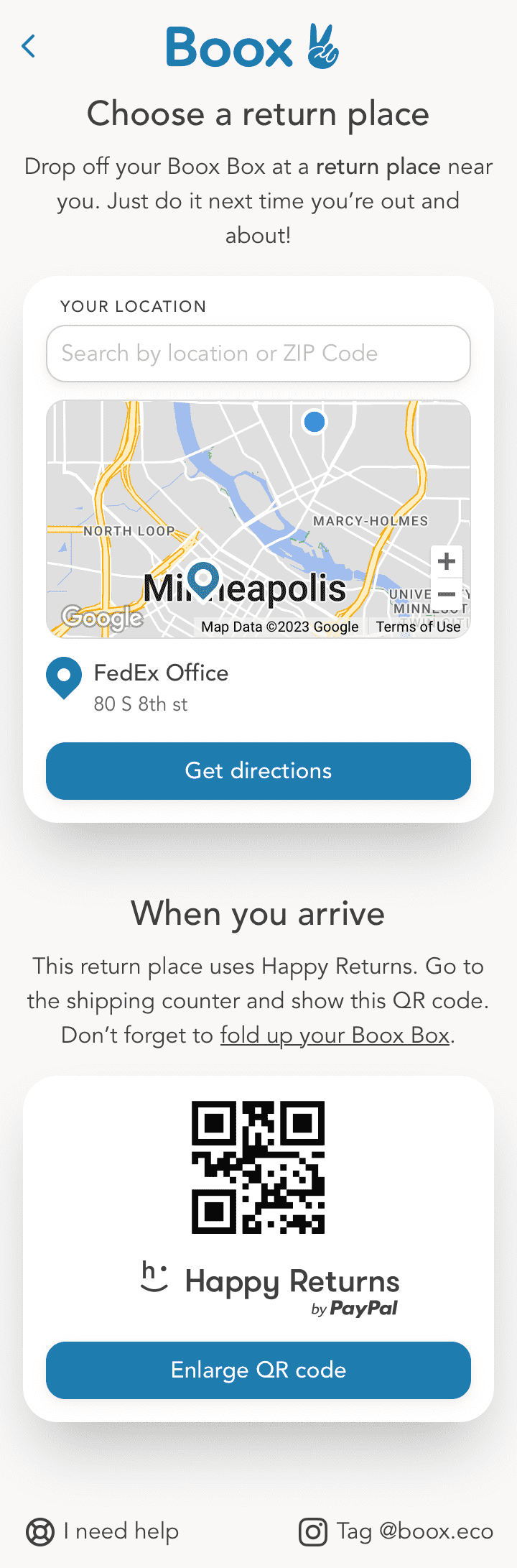
There are a million ways to show the benefits of our Boox. In our latest iteration, we chose to compare to cardboard boxes and settled on the idea that by shipping in cardboard, you’re sending your customers trash. This became a powerful visual, and one that resonates with a majority of our users. We’ve all had an entryway filled with cardboard boxes that won't be reused.
We also incentivize consumers to return their box by offering rewards they can use at the retailer that sent them the Boox. In the future, we may be able to scale this beyond that single retailer. Purchasing from a company that ships in a Boox could get you access to rewards from other companies in their portfolio.
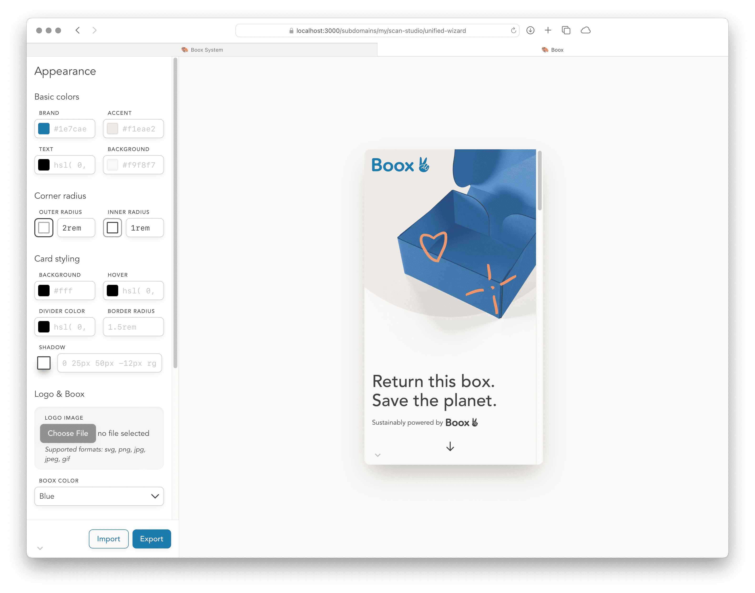
If the client was large enough, we’d allow full customization of the scan experience. We built our app to enable full white-labeling for various brands. We allowed for switching box colors, graphics, scan colors, fonts, spacing—everything you’d expect from a custom experience.


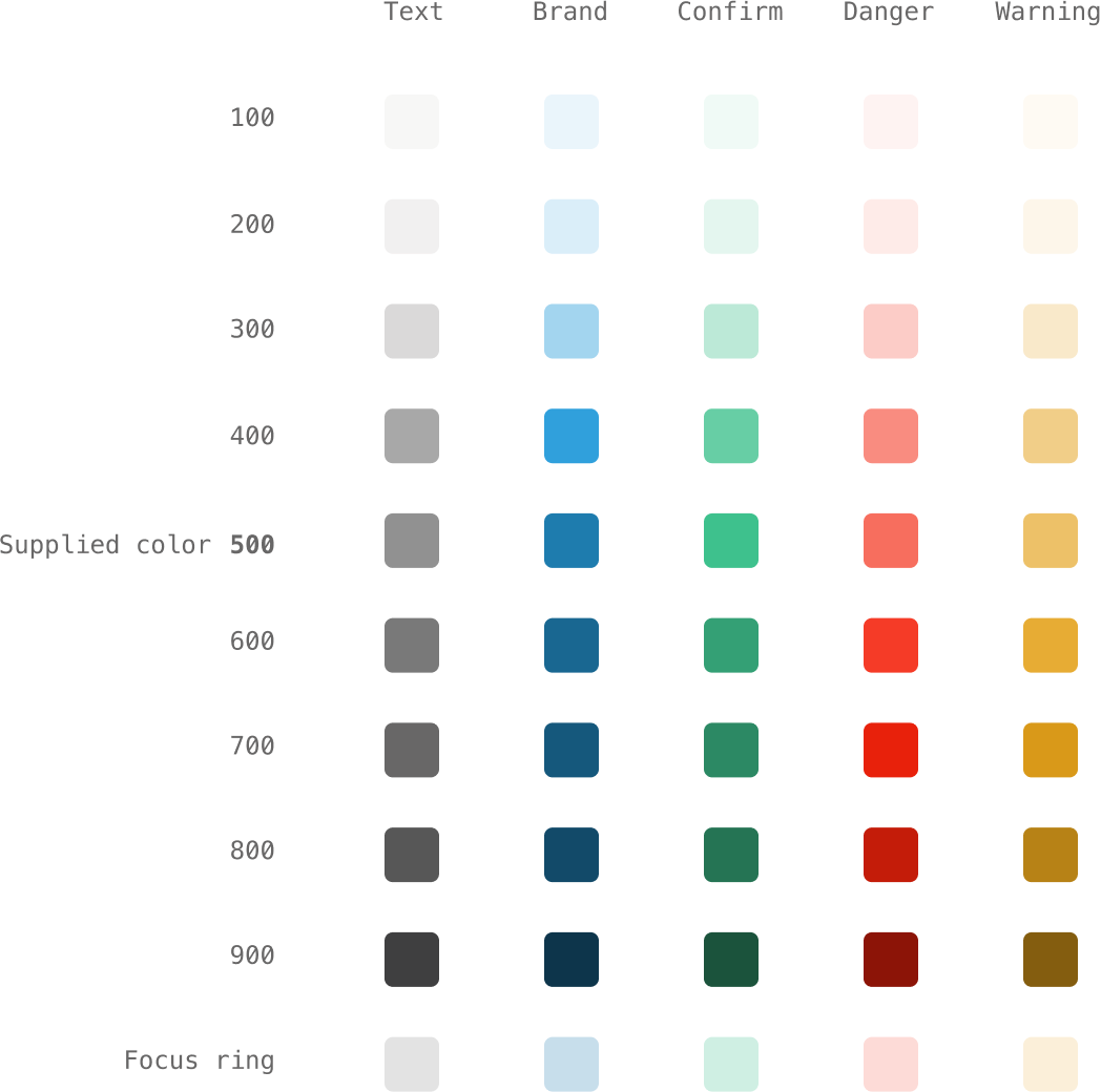
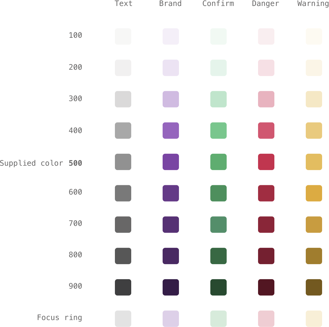
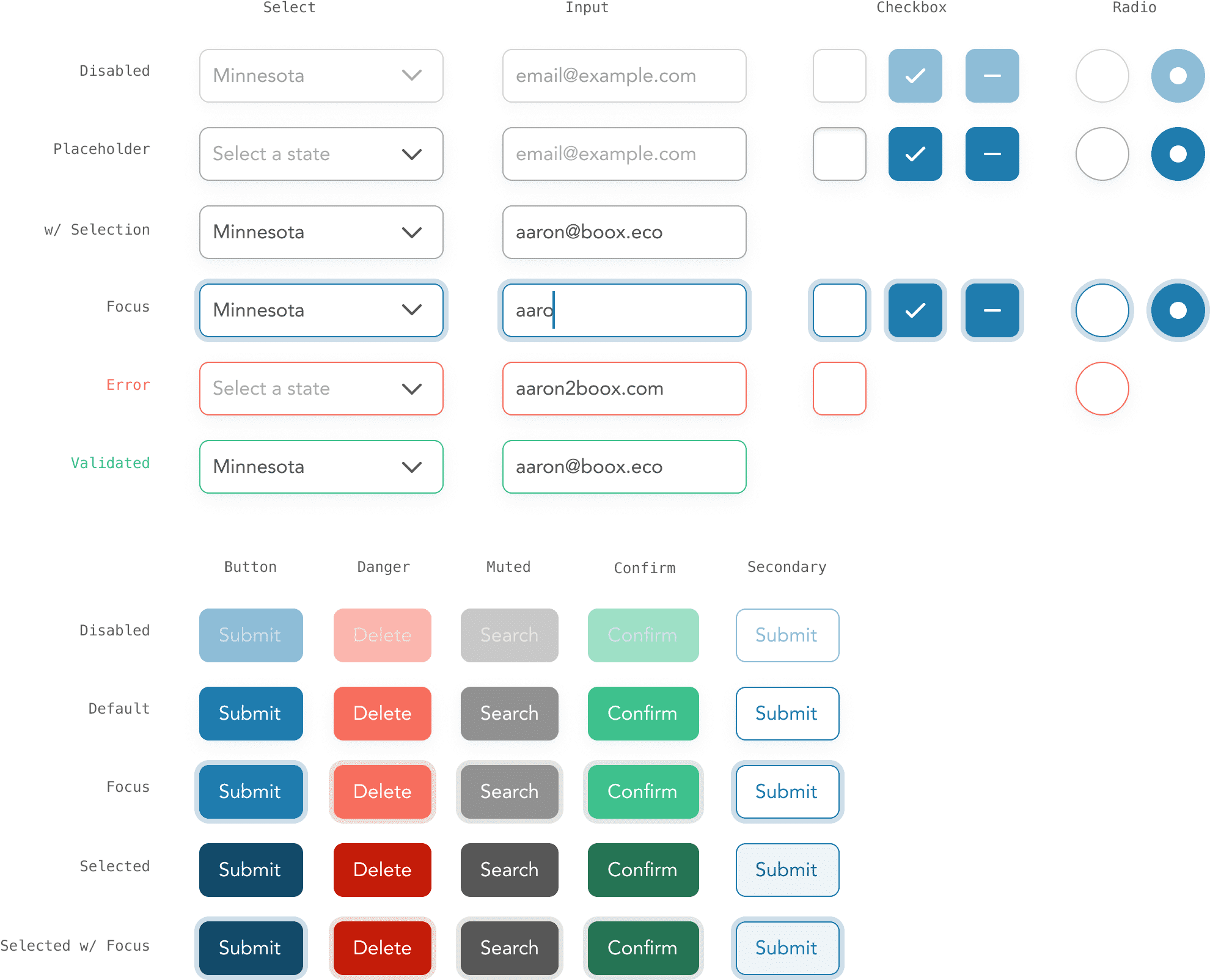
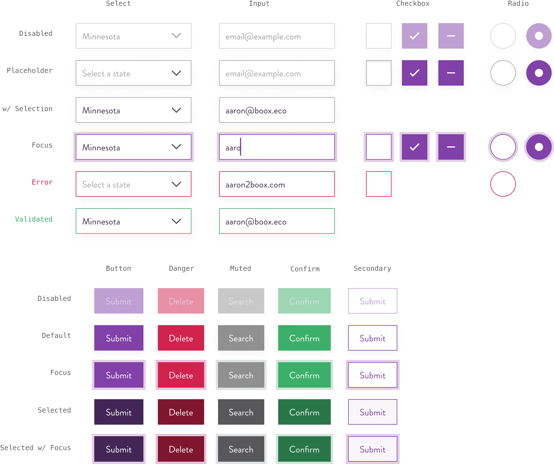
To power a white labeled experience, we generated a lean design system to power the scan experience.
To build our system, we isolated a few colors in our scan experience. We’d have colors for a brand, text, success, danger, and warnings. Each of these colors would have variations of lightness with 100 being the lightest, and 900 being the darkest.
In our configuration, we’d provide the middle value of
500 as individual h, s,
and l values. Then, we’d operate on those
individual values to re-assemble them as color gradations using
CSS calc functions.
:root {
  */ Determine the curve of color values between 0 and 1. More on this later */
  --step-100-value: 0.92;
  --step-200-value: 0.86;
  --step-300-value: 0.65;
  --step-400-value: 0.21;
  --step-600-value: 0.17;
  --step-700-value: 0.29;
  --step-800-value: 0.4;
  --step-900-value: 0.57;

  /* Store our brand color as h, s, and l values */
  --theme-brand-h: 201;
  --theme-brand-s: 70%;
  --theme-brand-l: 40%;

  /* Re-assemble the brand color as a single variable */
  --theme-brand-500: hsl(
    var(--theme-brand-h),
    var(--theme-brand-s),
    var(--theme-brand-l)
  );

  /* Darken the brand color by darkening the l value and re-assemble as a single variable */
  --theme-brand-600: hsl(
    var(--theme-brand-h),
    var(--theme-brand-s),
    calc(
      var(--theme-brand-l) - calc(var(--theme-brand-l) * var(--step-600-value))
    )
  );

  /* Lighten the brand color by lightening the l value and re-assemble as a single variable */
  --theme-brand-400: hsl(
    var(--theme-brand-h),
    var(--theme-brand-s),
    calc(
      var(--theme-brand-l) +
        calc(calc(100% - var(--theme-brand-l)) * var(--step-400-value))
    )
  );
}
To find how we’d operate on our colors, I built a small interface to fine-tune those curves to reliably accept any arbitrary brand color and spit out a proper color space. These are far from linear, and I wanted to tweak them visually, without relying on perfect math. This demo also includes an alert component that uses the lightest and darkest colors on a scale to determine if they’re usable.
This interface includes an arbitrary color picker to test the various scenarios. These are the production color curves chosen by myself and the Boox crew. There’s enough variation between each color stop, and it doesn’t fall apart in the edge cases.
You’ll notice there’s quite a jump between the 300 and 400 step, mathmatically. Visually, it’s equidistant. Trust your eyes.
We can do this with each of our hues, creating entire color palettes on the fly, while only tweaking a few CSS variables
See the Pen Newfangled Theming GUI by Aaron Shekey (@aaronshekey) on CodePen.
All of Boox’s experiences are built using Tailwind. Thankfully,
Tailwind allows for inclusion of arbitrary classes within its
@layer utilities directive. We can assemble each of
the colors we created using their nomenclature like so:
:root {
  /* Store our brand color as h, s, and l values */
  --theme-brand-h: 201;
  --theme-brand-s: 70%;
  --theme-brand-l: 40%;

  /* Re-assemble the brand color as a single variable */
  --theme-brand-500: hsl(
    var(--theme-brand-h),
    var(--theme-brand-s),
    var(--theme-brand-l)
  );
}

@layer utilities {
  .bg-brand-500 {
    background-color: var(--theme-brand-500);
  }

  .text-brand-500 {
    color: var(--theme-brand-500);
  }
}
This approach allowed us to use Tailwind-like tooling while being able to change the colors on the fly without compilation. Because a majority of our aesthetics were stored as CSS variables, we’d be able to build brand-specific experiences in the browser with our clients. And like Tailwind, these classes only get included in the bundle if they’re used. Sick!
Then, we can assemble each of these colors as components as needed. In the case of Boox, we built a small collection of form elements—buttons, inputs, checkboxes, etc.
Ultimately, a majority of our theming was built in-browser using CSS variables. This allowed us to easily build a theming studio, enabling our sales folks and clients to experiment with how their scan experience would look.
This tightened up feedback loops, reducing the number of back-and-forth emails. If the scan experience could do it, the client could customize it.
My year at Boox led to a far more cohesive experience across their website and scan experiences. I worked closely with Matt Semmelhack, Bob Walton, and Paige Russell to collaborate on branding, copy, and overall direction. It was an absolute pleasure to design and build with them in this space.