2015—2016
I had the opportunity to work full-time as a remote Product Designer at GitHub from March 2015 to October 2016. This is a collection of the work that I was able to help ship during my time as a Hubber™.
In early conversations with GitHub, I’d shared my desire to help simplify some of their core experiences. Increasingly, GitHub is used by non-programmers and programmers alike. Issue triage and project management are often equally as important as the code itself, especially as an organization grows.
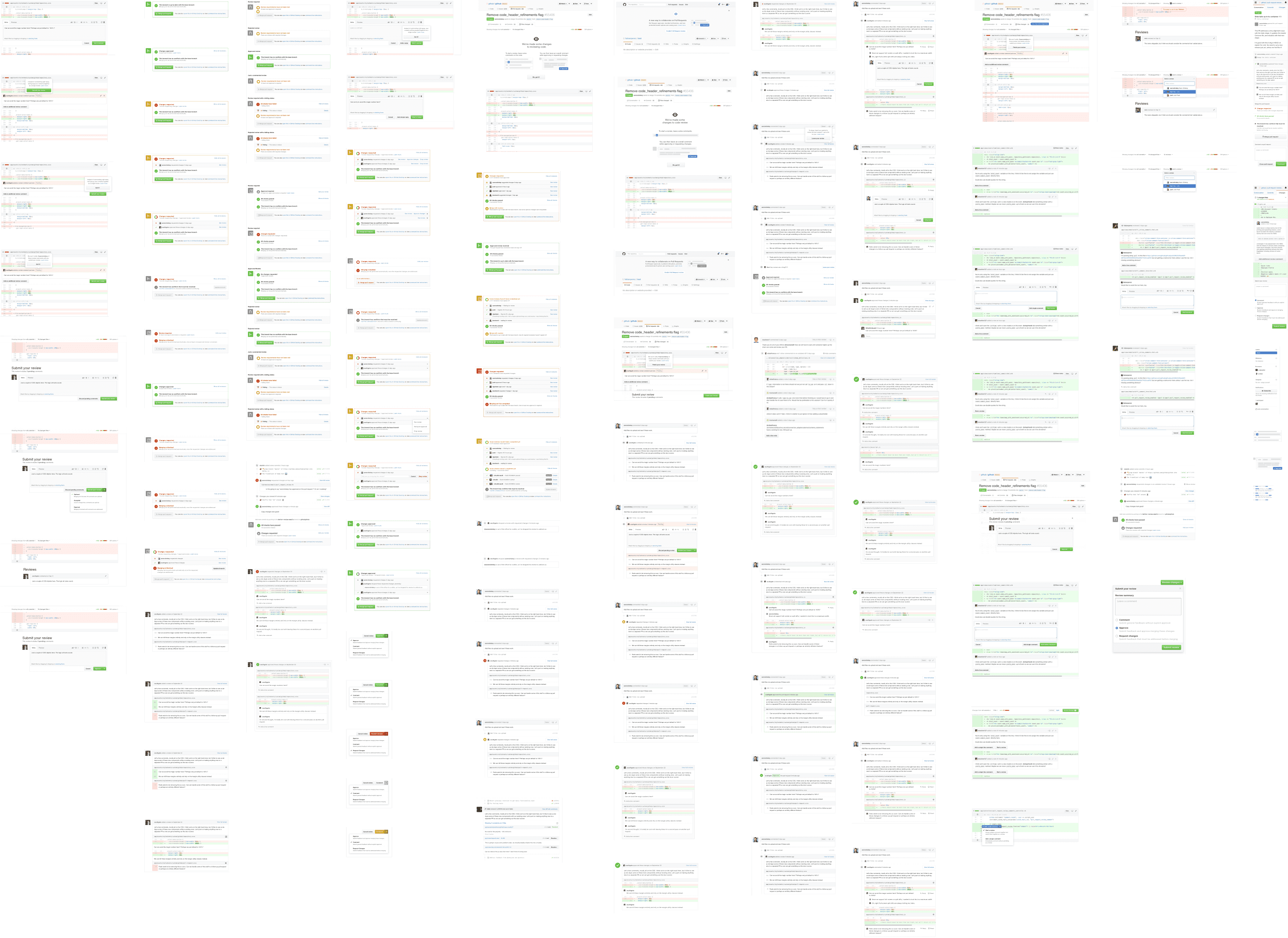
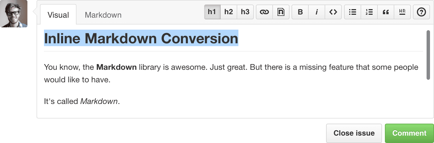
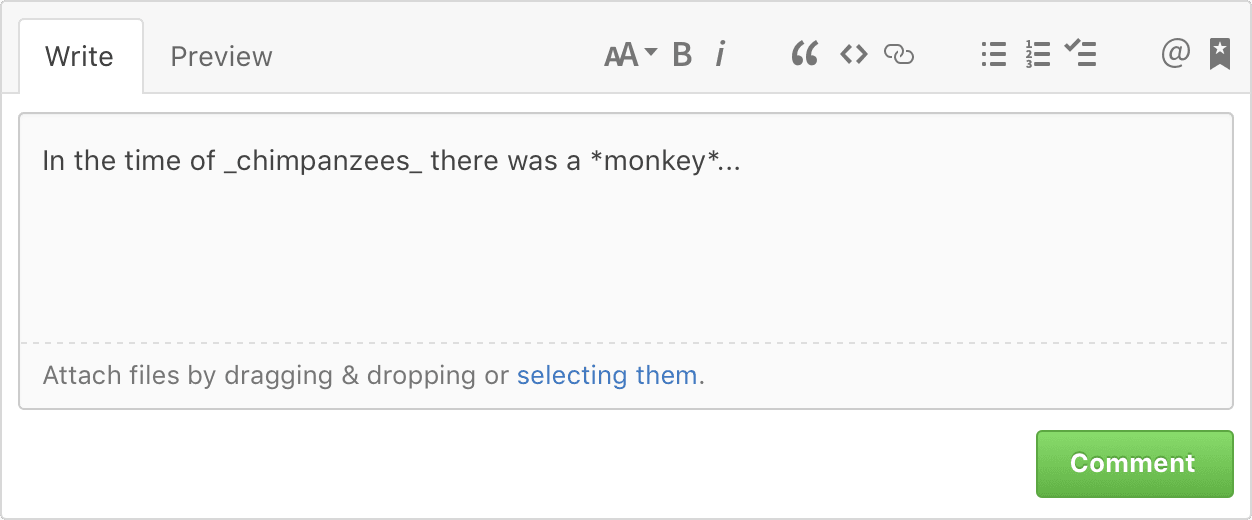
All of the comment fields throughout GitHub support GitHub-flavored Markdown. Markdown is a syntax that allows folks to make richer comments—adding things like links, lists, and images. Unfortunately, a great wealth of useful features were hidden behind this syntax. This seemed like a decent opportunity to add a lightweight toolbar to surface some of these. Prior to joining, we only had a link to a help document explaining the syntax.
I first considered revamping the existing “Write” and “Preview” pane. The comment area is plain text in the “Write” tab, but when switching over to "Preview", it shows the final rendered output. I was hoping to swap these experiences. Instead of frequently switching to the “Preview” tab, I wanted to build an editor that would render Markdown on the fly. I would call these tabs “Visual” and “Markdown”. Our visual editor would render Markdown on the fly, allowing full use of the toolbar for formatting text. If this wasn’t desired, users could always flip tabs to see their raw Markdown. We’d remember that preference and allow for folks to ignore the Visual editor entirely. This style of editing was popularized by Wordpress.
This being the very first issue I’d posted to github/github, it was wisely suggested that I scale back the scope of modifying our site-wide comment box. Fair enough!
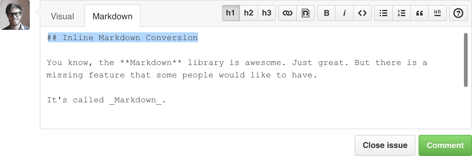
I then wanted to try to add light styling to the “Write” tab. This could allow for less toggling between the “Write” and “Preview” mode. Italics, for example, could be rendered inline while still showing the Markdown syntax. This is a popular pattern and turns up in lots of Markdown-based editors like iA Writer.
Ultimately, we ended up building a single toolbar for our GitHub Flavored Markdown without modifying either of the tabs. Instead of hiding Markdown functionality behind a help link, we put our powerful, but less-used features up front in a toolbar. Task lists, for example, are a really powerful project management tool that very few users knew about. The toolbar shows powerful features while making it easier for beginners to use GitHub. Rad!
While iterating, we stripped the button treatment on the toolbar. Since we didn’t want this feature to feel intrusive, this made things a lot lighter. We also ended up grouping functions by similar tasks. Text manipulations, links and media, lists, and less-used GitHub-flavored Markdown features are all properly grouped.

The heavy lifting on this feature was done by @skalnik and @probablycorey. I drew pretty pictures and provided the UI work, and helped build proof of concept prototypes. Have a look at the product release blog post.
After our markdown toolbar shipped, many users would soon discover our task list feature.
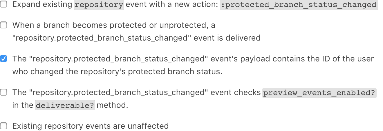
Tasklists are interactive lists that allow users to add tasks that can be checked off as they’re completed. They’re often used to describe the scope of the work left to do in a particular issue or pull request. They’re also used in meta issues, that act as a way to track the status of other issues or pull requests. Whenever issues or pull requests are displayed in a list, we expose the number of completed tasks in the issue body as a progress bar.

Since users were now using task lists more frequently, we received lots of requests for the ability to re-arrange these items without having to edit the original comment.
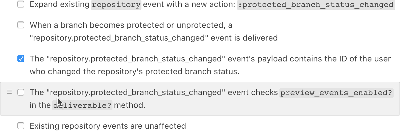
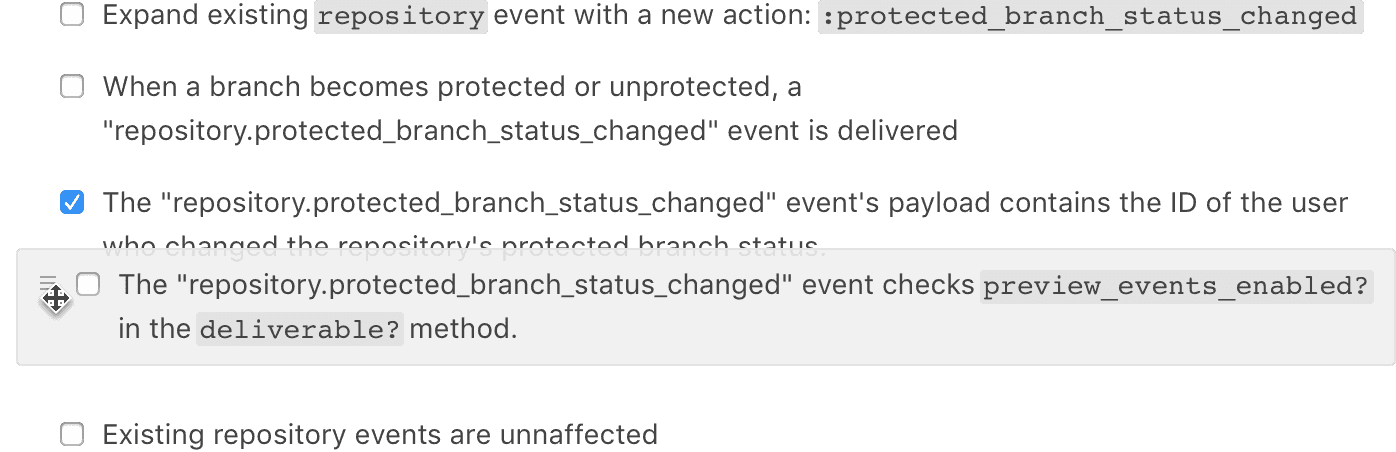
Early in the exploration of this feature, we discovered that since the task lists were already indented, we could use this empty space to show a drag affordance on hover. After a quick number of iterations, we landed on a simple three-bar’d icon approach.

On highlight, we’ll show the grabber, but we’ll only change the cursor when the mouse is to the left of the checkbox so as not to interfere with text selection and checking the box. We’ll highlight the entire row and give it structure, so it’s more obvious what you’re about to drag.
This feature was built by @skalnik, @jessicard, and @dgraham. @aymannadeem was in charge of the product direction. Check out the blog post announcing the feature.
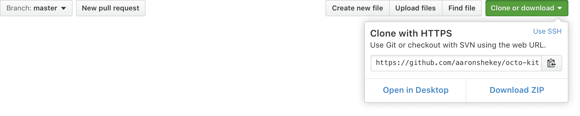
Adding files to a repository on GitHub can be difficult. GitHub has great workflows for adding and editing single files, even allowing users to create pull requests from these edits. It’s a powerful way of collaborating on GitHub without having to leave your browser. However, there was no simple way of dragging and dropping files into a repository.
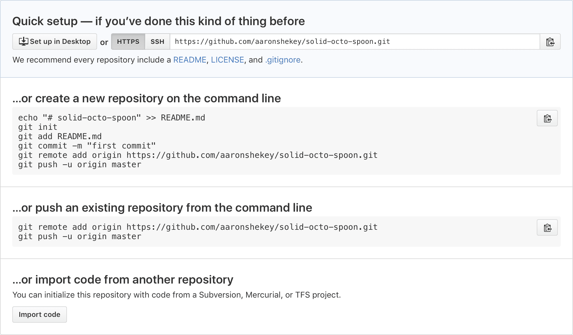
This is the blank slate that most users see when they first create repository. We offer instructions for interacting with your repository via command line, but for many users, a user interface will always be more approachable and accessible. We should make adding files as easy as editing them.
Since we’re adding files to a repository, my first explorations started with dragging and dropping files onto the file tree. I thought we could be clever and use the file tree’s background itself as both the drop target and the progress bar. In practice, this was a bit frustrating to use since the file tree didn’t have a fixed size. If a repository only had a single file in it, we would have a a much smaller drop target. This was easy to miss, and hard to discover, especially for a feature that should be optimized for empty or nearly-empty repositories.
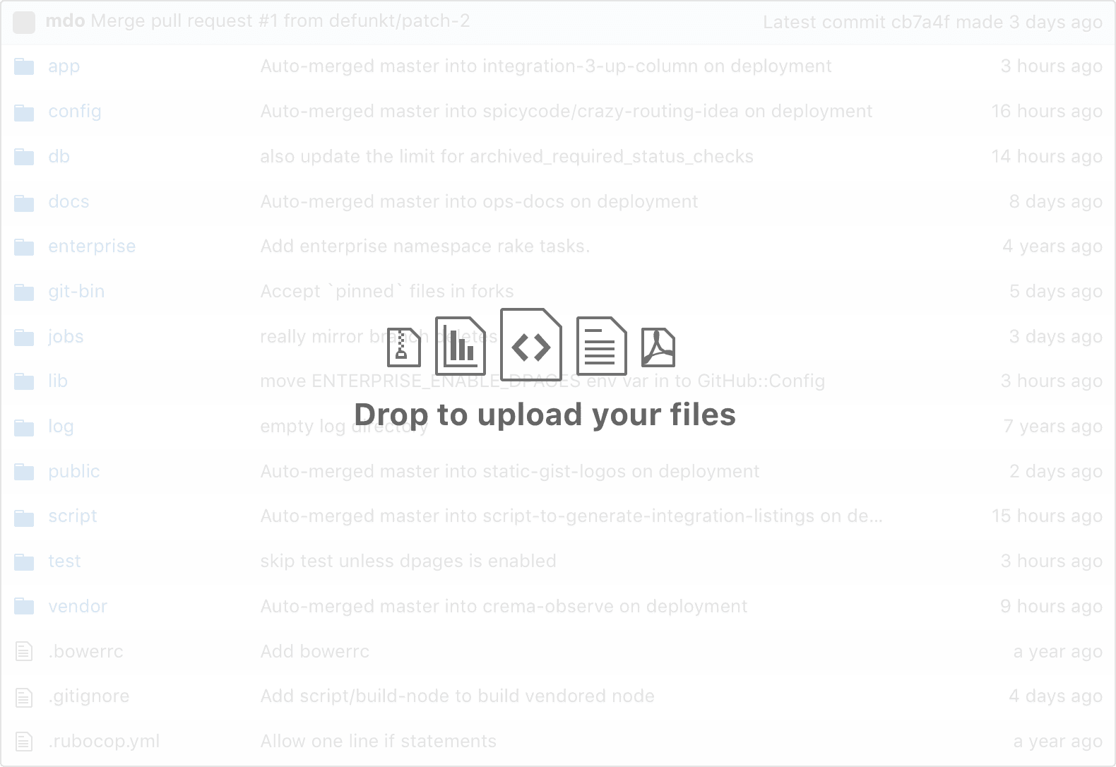
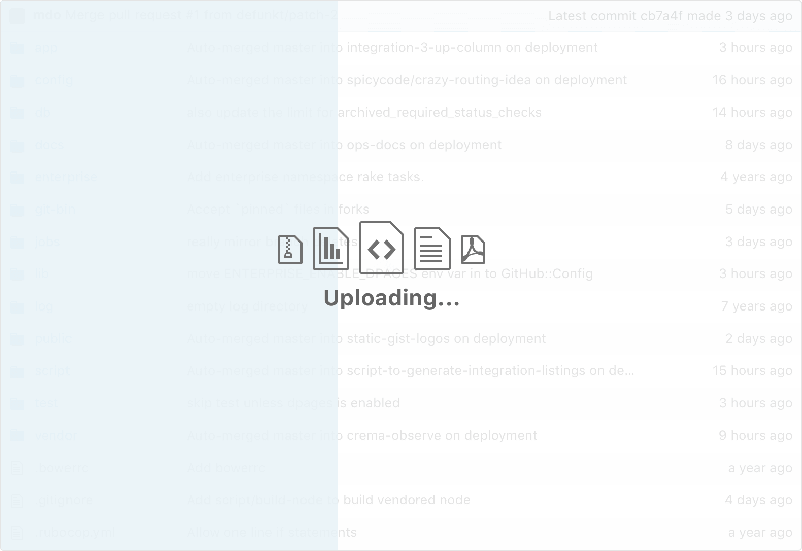

The next approach moved the drop target to the full browser window. This allows users to more easily drop their files anywhere in the code view regardless of the size of their repository.
While this was certainly better for users familiar with dragging and dropping, it wasn’t very discoverable or accessible.
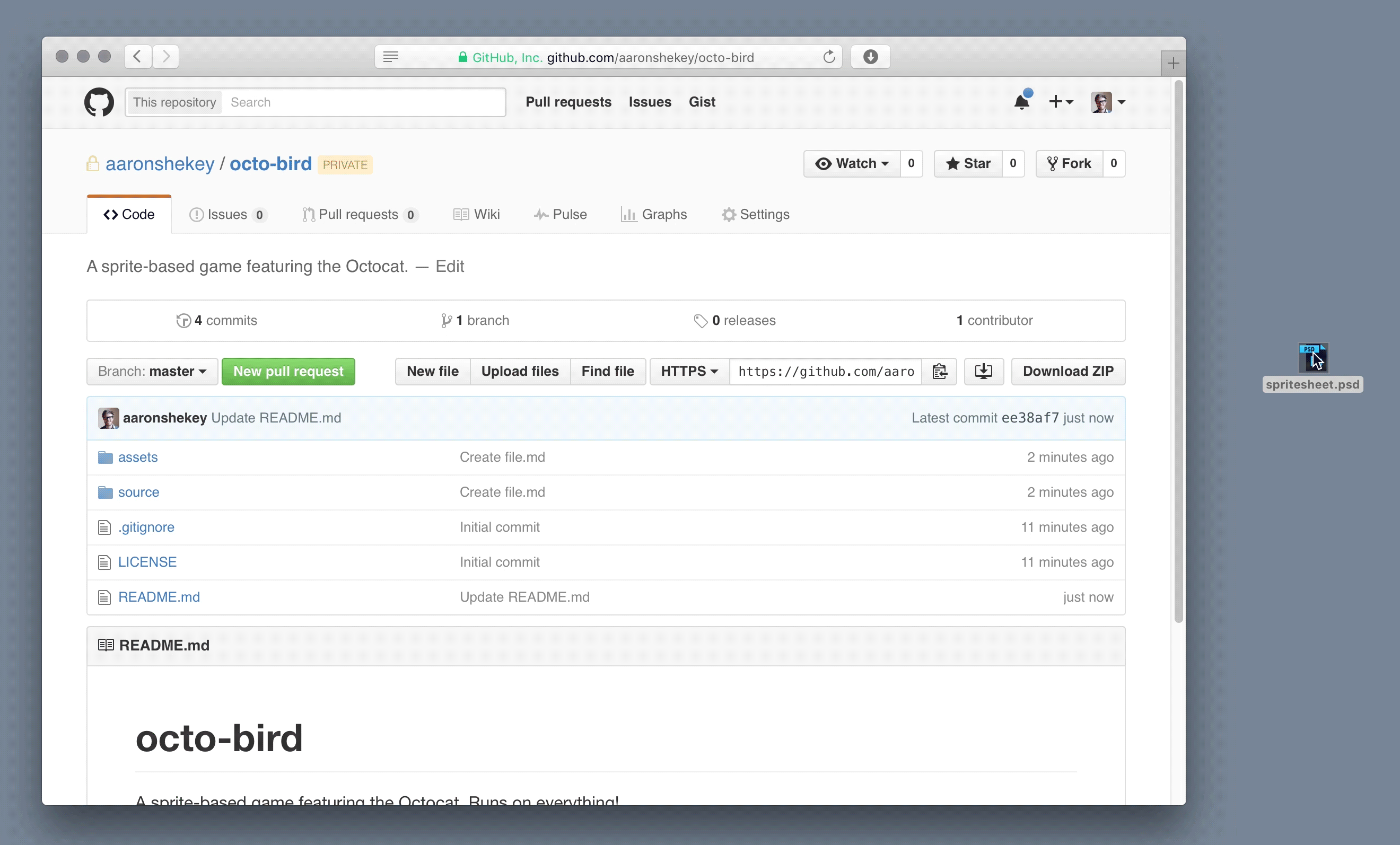
This led the team to add an explicit upload button that would present an entirely new view with both a drop target and file chooser.

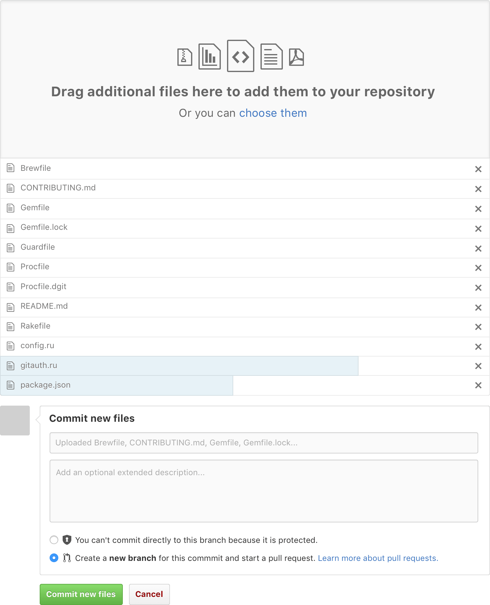
In addition to a progress bar, we now had a consistent place for error messages and other edge cases. We could also allow users to stage their files and delete any errant uploads before showing them the familiar git workflows of committing directly to the branch or opening a pull request.
Simply adding an upload button to our code view revealed a bit of design debt. We were quickly running out of space to add these buttons, and our design was suffering as a result. A small side-project revealed a couple optimizations.

This feature was written about on GitHub’s blog. Early explorations were made with the help of @mdo and @jasonlong. The feature was built by @skalnik and @dgraham with myself handling the user interface, overall experience, and the CSS transitions (I’m quite proud of those).
github file upload, omg the end is near.
— @korrek_penderis February 19, 2016
Since a lot of GitHub’s userbase has started to become part of larger teams, we began looking seriously at features that allowed for more granular permissions where possible. Too often in organizations large and small, a collaborator might accidentally commit to the wrong branch, master, for example. In worst-case scenarios, this could result in lost work via force push.
Protected Branches allow for repository administrators to block committing to certain branches. This required adding a settings page that allowed for protected branch management.
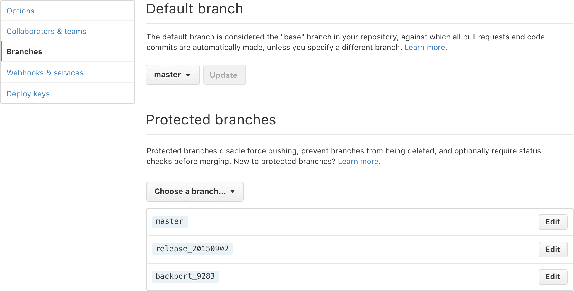
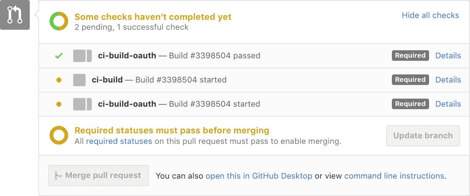
In addition to blocking pushing directly to the protected branch, administrators can require status checks. These statuses are bots that can check for all sorts of things—code quality and linting, integration tests, regressions, etc.
When these status checks fail, you can disable merging to the protected branch.
Since both our settings page user interface language and our merge area were well established, most of the design work for protected branches was focused on writing clear copy that was balanced and discoverable. This copy writing extended to each edge case—a rogue status test, for example. Design is writing, after all.
Protected branches was one of the first features I worked on at GitHub. It was built by a ton of people, @aroben, @rsanheim, and @nakajima to name a few, with product direction being provided by @bleikamp. Check out the blog post announcing the feature.
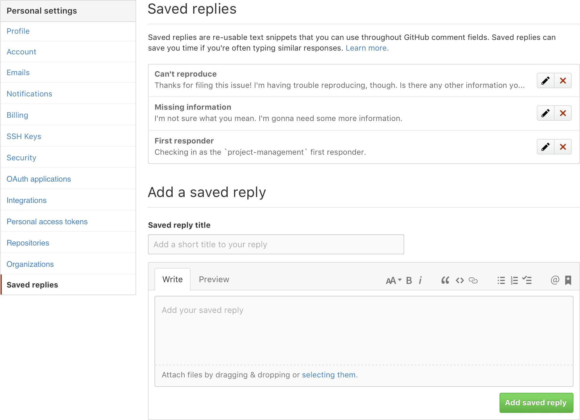
When a large number of GitHub power users started to talk about their desire for re-usable snippets of text throughout GitHub, we thought this might be an opportunity for a new feature. Saved replies allow you to create any number of canned responses. These could aid in better responses to bug reports or issue triage, for example. Or perhaps you’re just sick of responding to that same feature request or bug.
Like any project at GitHub, there are a lot of questions that need to be answered, even for what seems to be a simple feature.
I’m sure you get the idea. Ultimately, I argued users would get the most utility out of their saved replies being stored in the database at the user level. This way, we could easily test their usage and saved replies would follow users around to any repository, regardless of ownership. Managing your saved replies would show up in your user settings.
Like Protected Branches, much of this design system already existed, making short work of adding the settings page.
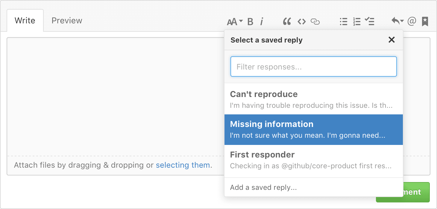
Since we’d added the Markdown toolbar to all our comment areas, it made sense to access saved replies as another GitHub-specific button.

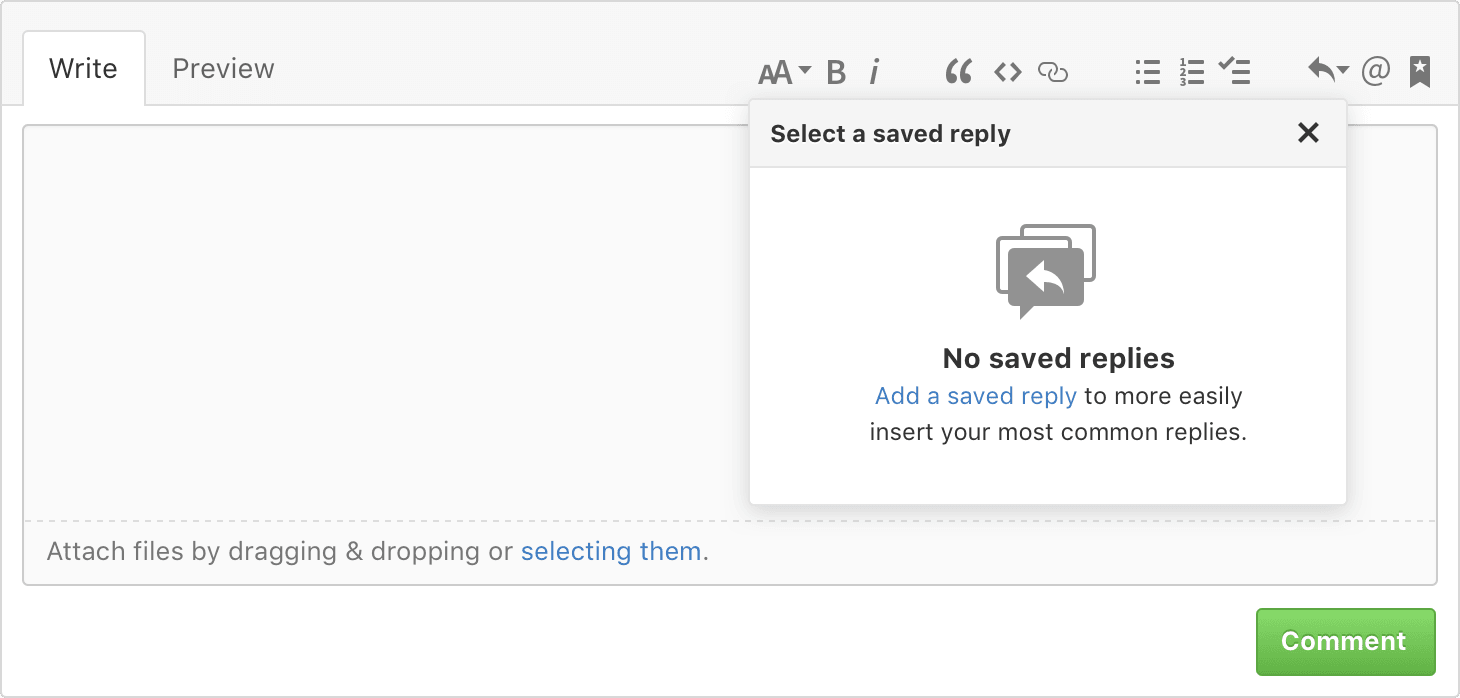
This posed a problem for first-time users of the feature. I crafted a blank slate that helped explain what the feature was and offered folks a way to create their first saved reply. This brought the user to their settings page where further information was provided should they need it.
Saved replies was built by @dgraham with @aymannadeem providing product direction.
GitHub.com and every other GitHub property (Atom, GitHub Desktop, GitHub Universe, etc.) each use an icon library called Octicons. These are little open source 16x16px vectors that are delivered via SVG. This allows for resolution-independence as well as coloring on the fly via CSS.
Prior to 3.0, Octicons were pretty chunky, especially when paired with system fonts. Different stroke weights appeared throughout the set. Corner radii were inconsistent. Nested corners were the same radius as their parents, leaving things feeling unnatural. Some icons suffered from legibility issues.
Over the years the icon set had grown to include icons that were rarely used and possibly made sense with another metaphor entirely. This was an opportunity to pare down the collection. We could also explore making some of their visuals a bit more harmonious. We lost a bit of consistency over the years. It was time to try to get some back.


In early style explorations, it became obvious that there wasn’t a ton we were going to be able to change within the core Git icons. Thinning them to 1px left them fragile, unreadable. Since we’ve built a brand around these metaphors, changing them wildly was out of the question. These icons would have to stay put.

Previous efforts had normalized all strokes to 2px based on these icons. This made all the icons really thick, leaving little room for detail on inner shapes.

These explorations led to a loose rule of 1px outer strokes, supported by a 2px inner stroke. Some of these strokes would have to be fussed over, optically, to keep things from appearing too razor-thin.
There were some exceptions to this rule. File-types, for example, were really muddied by 2px inner strokes.
We also standardized on 1px corner radii to soften the overall appearance of the iconset. We were careful to never double those corners on the inside, leaving the edges hard. The calendar icon shows these rules well.

When building icon sets, it’s easy to fall into the trap of working on them all within a single canvas. This can be a form of tunnel vision. It certainly means a more harmonious set, but it can easily create a worse experience when they’re viewed in context of a large app like GitHub. Our folder icons, for example, needed to be filled so users could more easily discern between files and folders, even though this means the overall icon set is less harmonious when each icon is viewed side-by-side.
Similarly, the sizing of certain icons needed to be revisited once they were shown in context. Strokes, baselines, and overall metaphors needed to be considered in this context as well.
Taking a fresh look at our icon set allowed us the opportunity to revisit a couple metaphors used throughout GitHub. We were able to swap our global notifications icon from an inbox icon (aka “Robot Bikini Top”) to the more common bell shape. We also embraced a redrawn gear, shying away from using our ‘tools’ icon for settings and the like.

This was but one step toward a more cohesive, harmonious GitHub experience. @jonrohan did lots of testing with me in determining the best way of delivering Octicons as SVG on GitHub.
By far the largest project I worked on at GitHub was code review. Prior to this feature, code review was an informal process that happened in pull requests. Say you wanted to make some changes to your app’s code. You’d make your changes in a new branch, and then create a pull request to merge those changes into master. Prior to protected branches, there was really nothing stopping anyone from merging those changes without oversight. Social conventions steered people toward asking someone to view your changes and leave comments, but these comments couldn’t keep folks from merging into master, regardless of the code quality.
We could fix this with a first-class code review process. We wanted to do a few things:
The first thing we needed to do was provide a user interface to actually leave the review. In pull requests we already had the ability to leave comments on individual lines of code. Doing so would send a notification to anyone participating in the pull request. This ended up being super noisy even in pull requests with few changes.
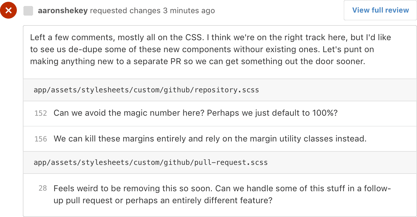
We wanted to add on top of this informal process by adding an explicit approval. We also needed the ability to request changes on specific lines of code. Further, people could add an additional overall comment. We first needed a place to do this. My original approach was to put a new form at the bottom of the “Files changed” tab. Conceptually, this seemed to make sense, since users would read from top to bottom, and then leave their overall review at the end.
In practice, this proved to be a little cumbersome. Not everyone’s code review process is that linear. After building an early version, we found that users often write a few comments, move onto another task, and then return to the pull request later. The review footer was often missed or ignored entirely, especially if the diff was a long one.
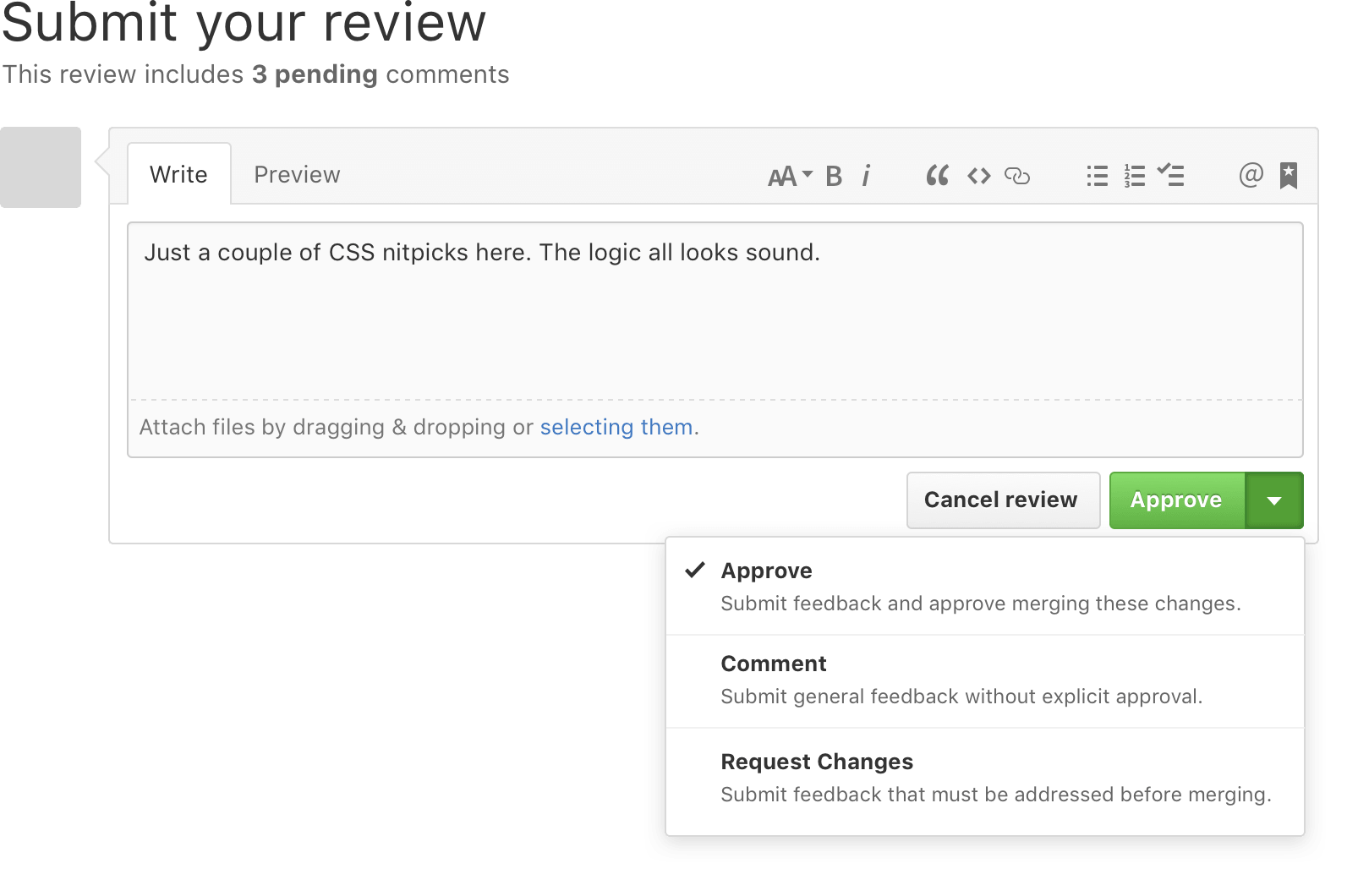
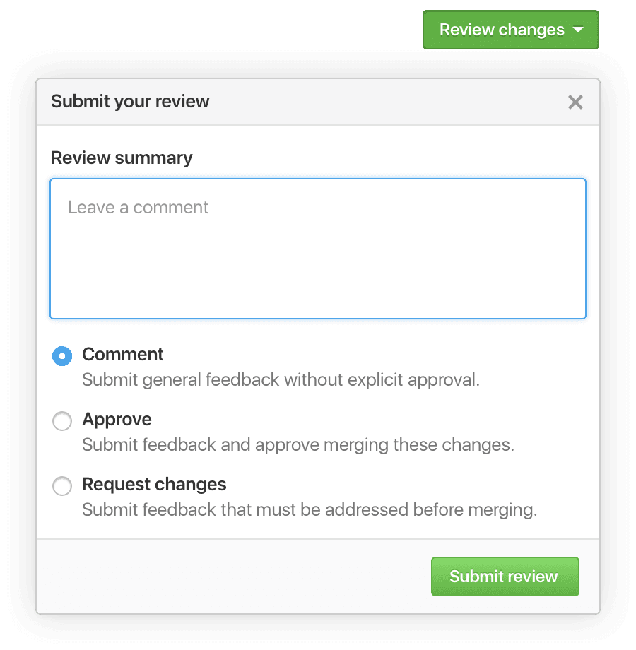
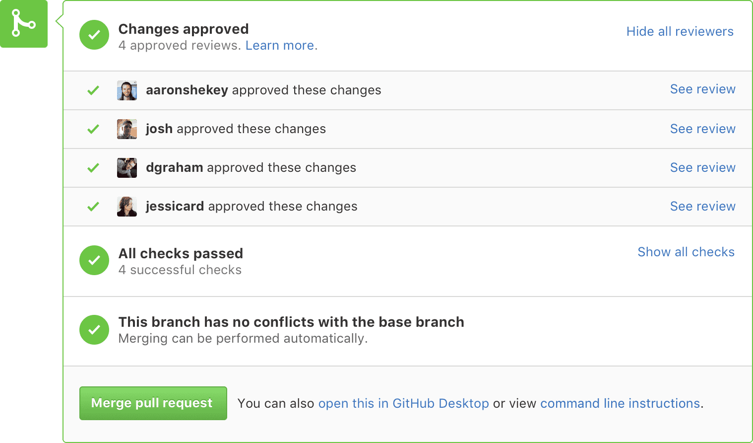
Instead, we moved the act of signoff into a popover that lived in our already-sticky header. Instead of showing our approve, request changes, or commenting options in a drop down combo box, we’d make it a permanent fixture. This made code review more discoverable, and allowed us to more easily disable those options if needed depending on the user’s permission level.
To cut down on the noise that commenting on a line of code made, we decided not to submit comment immediately. Instead, we’d batch these up into a pending state before submitting them together with the entire review. This proved to be slightly tricky, since we’d be changing behavior slightly. We’d need to show that comments were in a pending state.
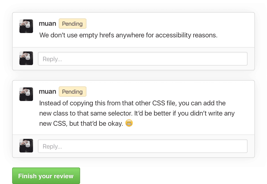
Since users were now submitting entire review objects with 3 potential states, and an arbitrary number of comments, we needed a way to thread them into the conversation view. I originally took an aggressive approach, only showing the comments and the line numbers where they occurred. It was an interesting goal, but it ended up reducing the overall readability of a conversation. There was just too much clicking required to tell what the hell was going on.
Instead, we needed to show more context for where the conversation was taking place. We also needed a way to quickly reply right inline with comments. In internally-shipped versions of code review, the only way to reply to a review was to then leave your own review. This was super cumbersome. We’d always had a version of replying to line comments, but their positioning was only inferred. With code review, we also built a first-class version of replies that follow the original comment around, regardless of context.

The final piece in code review was allowing or disallowing merging based on the status of review. For the default, it was decided that in order for a pull request to merge, it would require at least one approved review and no reviews requesting changes. In terms of our user interface, this would require another section in our merge area. There were a ton of permutations in this section already, since pull requests may already require statuses on top of reviews. This needed to be accounted for in the design exploration.
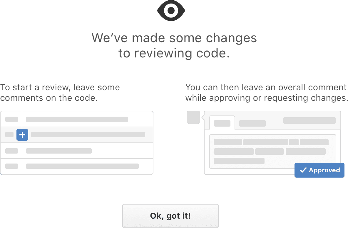
Since we were making pretty substantial workflow changes, we needed a way to announce them. GitHub has a nice history of blogging and making announcements, but often our users miss these. I proposed an interstitial that folks could dismiss once they understood the changes. This included a large banner explaining what code review is, as well as smaller tutorial popovers explaining that comments were now batched.
Code review was built by @dgraham, @nplasterer, @jessicard, @rsanheim, and @skalnik, with design direction & collaboration being provided by @connors and @fabianperez. It seemed the feature touched just about every single part of the GitHub codebase. It’s no small miracle that the feature worked as well as it did. The effort the team put in to make sure it shipped was nothing short of amazing.
Working on GitHub was an amazing experience. It was my first foray in using chat ops to deploy live changes to a massive userbase. Since GitHub uses GitHub to build GitHub, it’s exciting (and sometimes frustrating) to be fully immersed in the product you’re building. Helping build even the smallest feature at such a massive scale was often nerve-wracking, but fulfilling.
This post serves as a greatest-hits, so to speak, of my time at GitHub. Countless tiny refinements are made by each of GitHub’s talented designers and engineers every day. This post also only highlights actual directions that were explored. As an example, a feature like Code Review often results in a Sketch file with a ton of revisions and exploration. It can also spawn a number of prototypes that are simply too ephemeral to capture here. This is an account of what actually shipped. ✌️